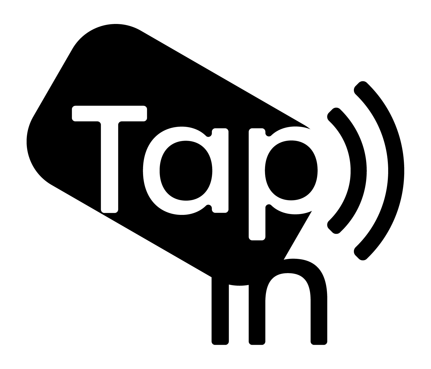
TapIn Logo And Branding
The objective of this redesign was to replace and enhance the previous logo and branding to showcase TapIn’s values of security, protection, growth, friendliness, and ease.
TapIn’s new brand identity now stands out as a trailblazing product.
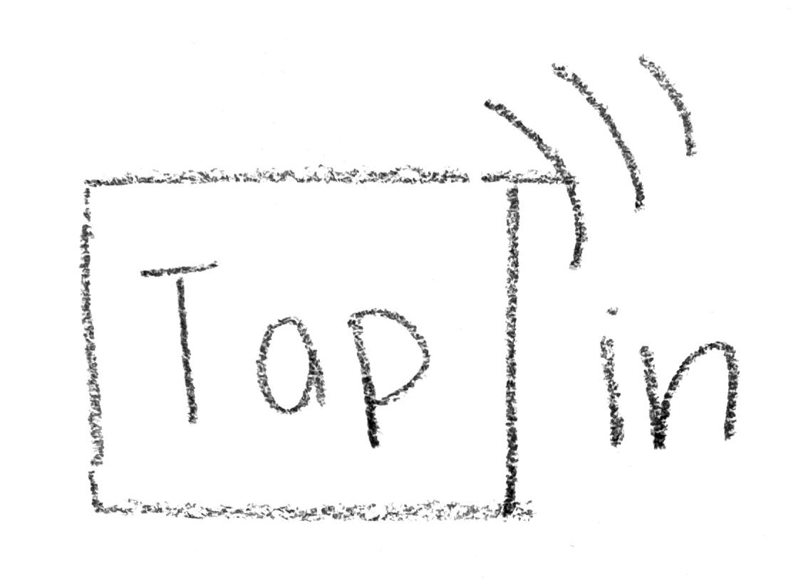
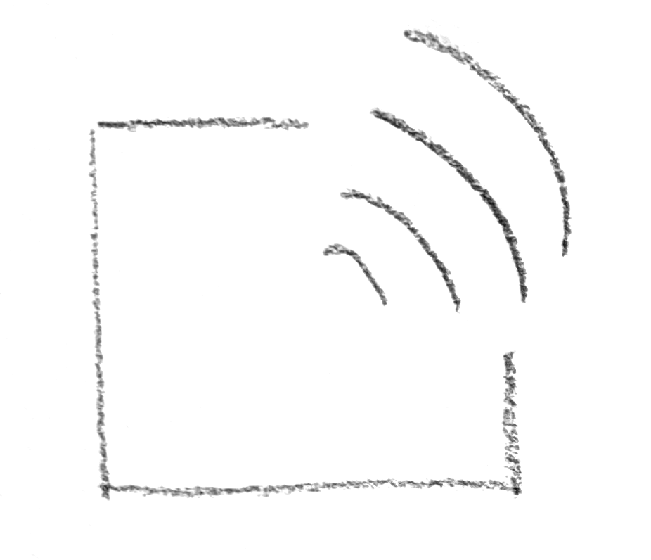
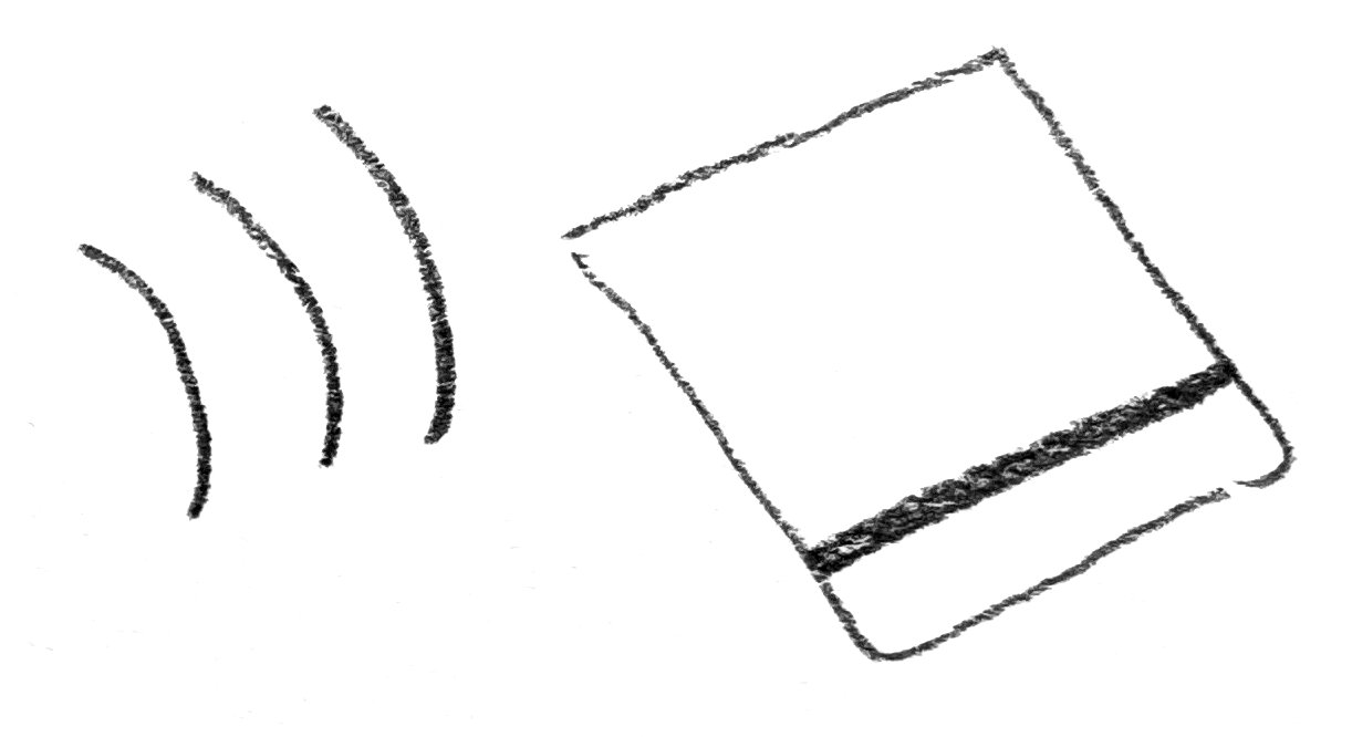
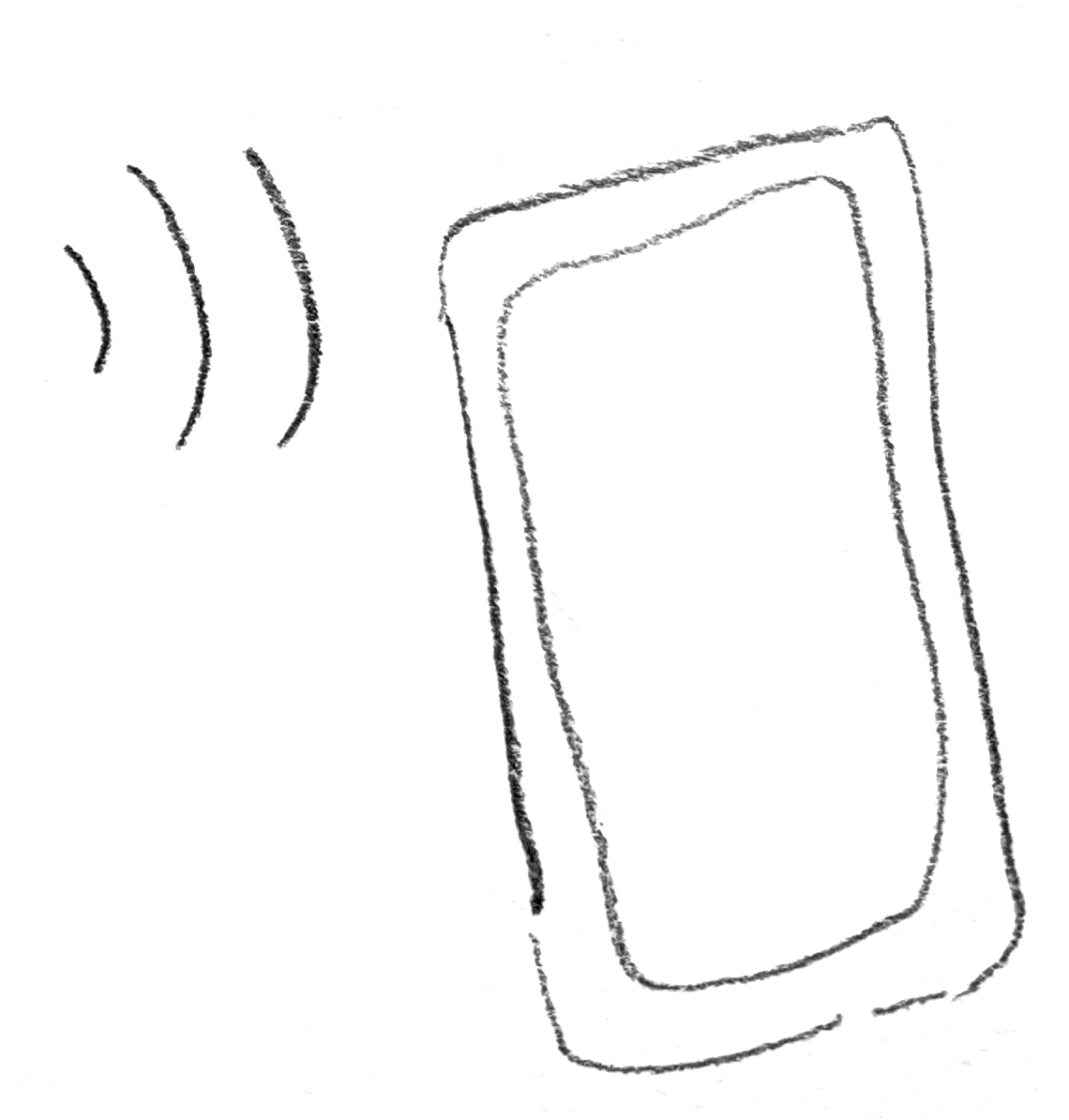
Sketches
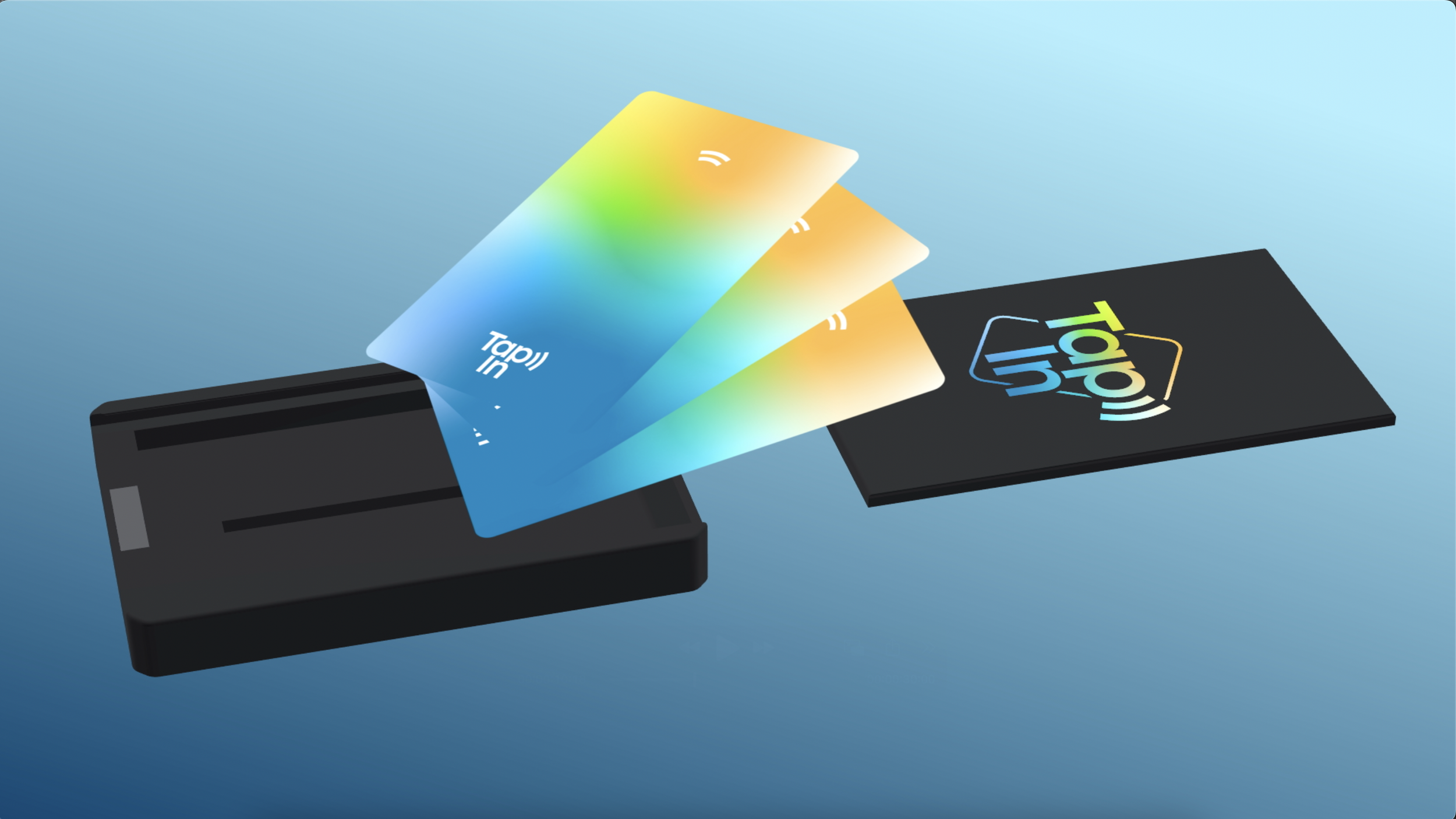
Sketches illustrate how a near-field communication (NFC) antenna in the TapIn technology interacts with a card or phone to launch a digital experience.
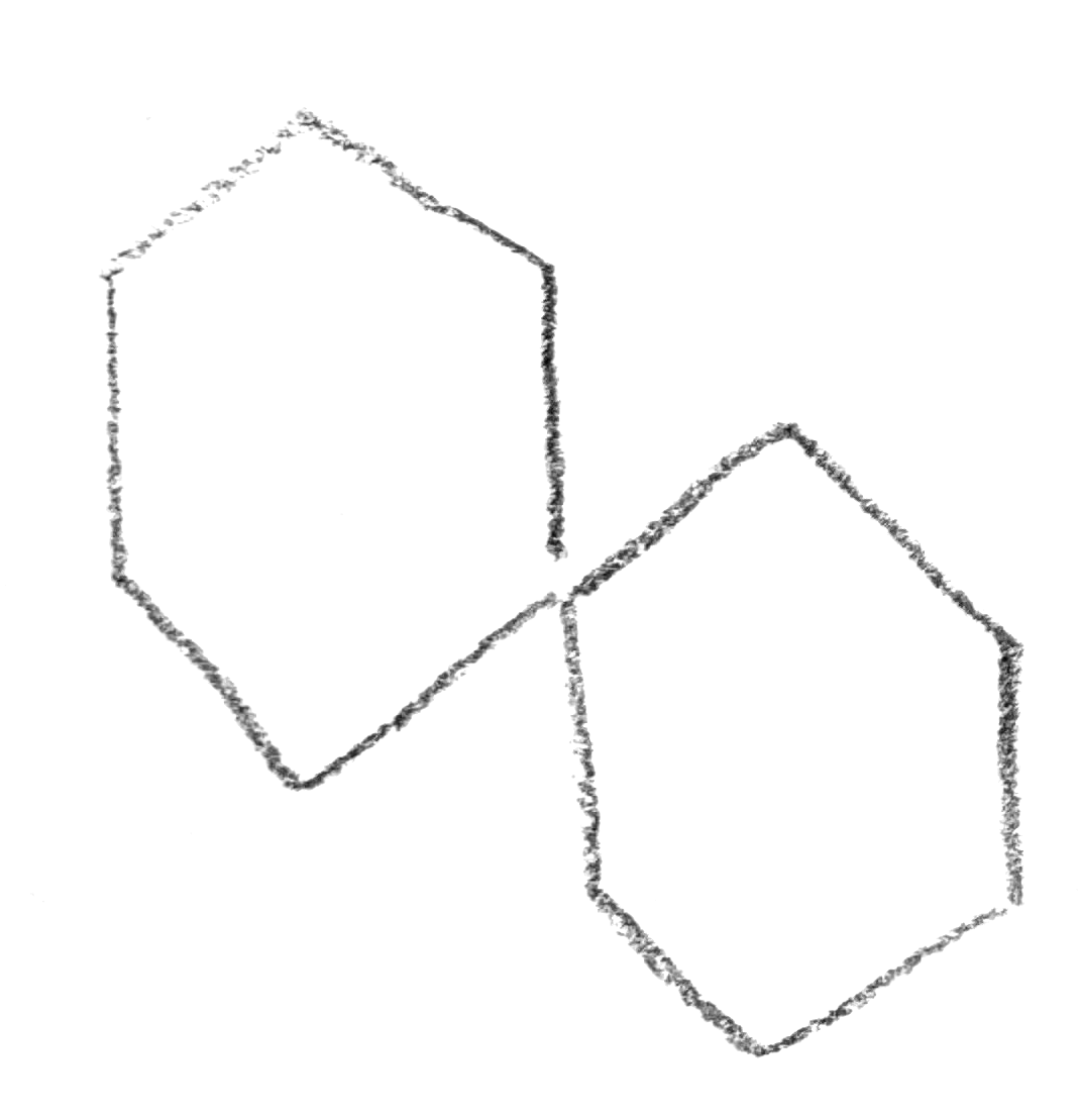

Digital Ideation


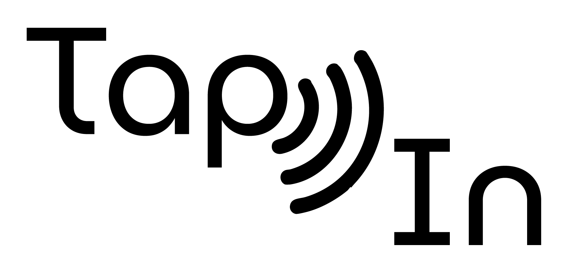
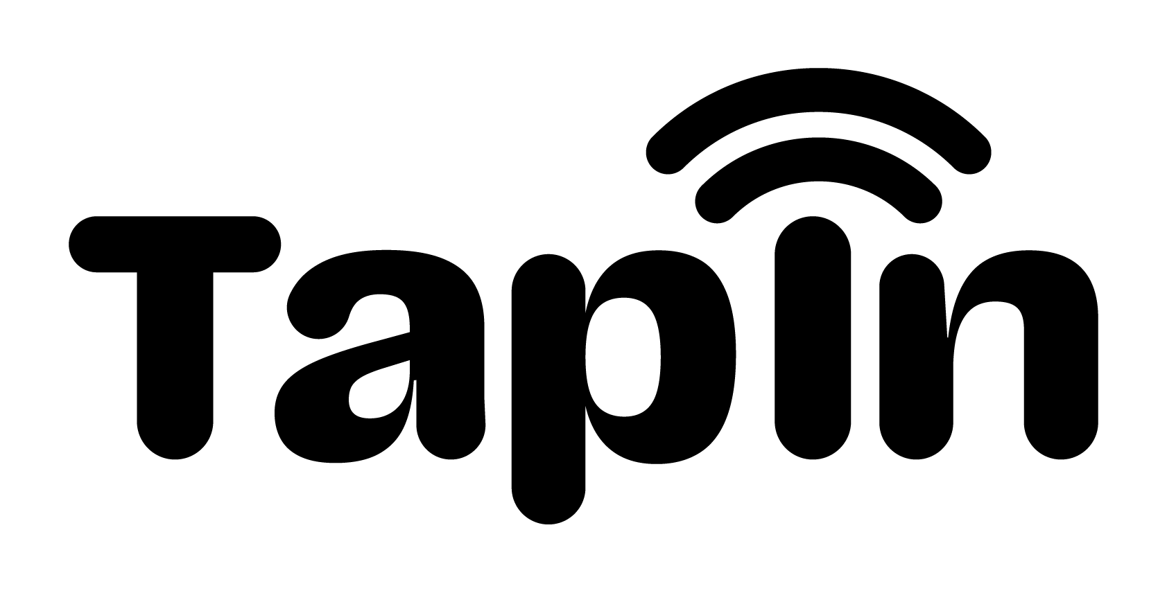


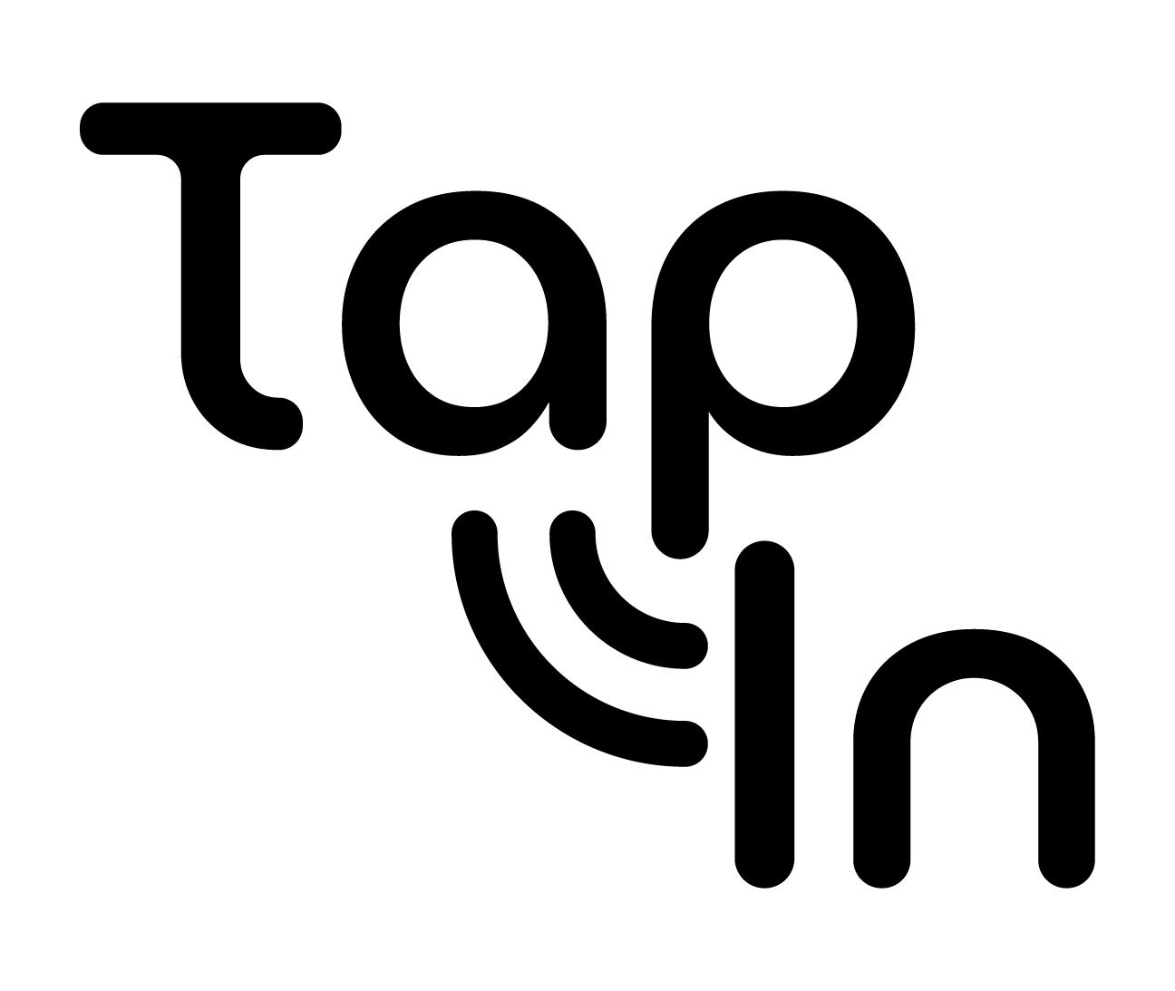
Logo Iteration
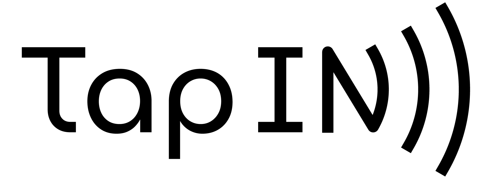
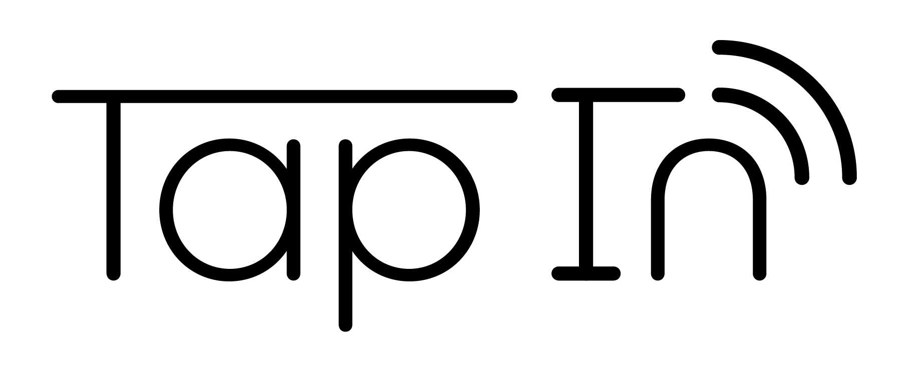
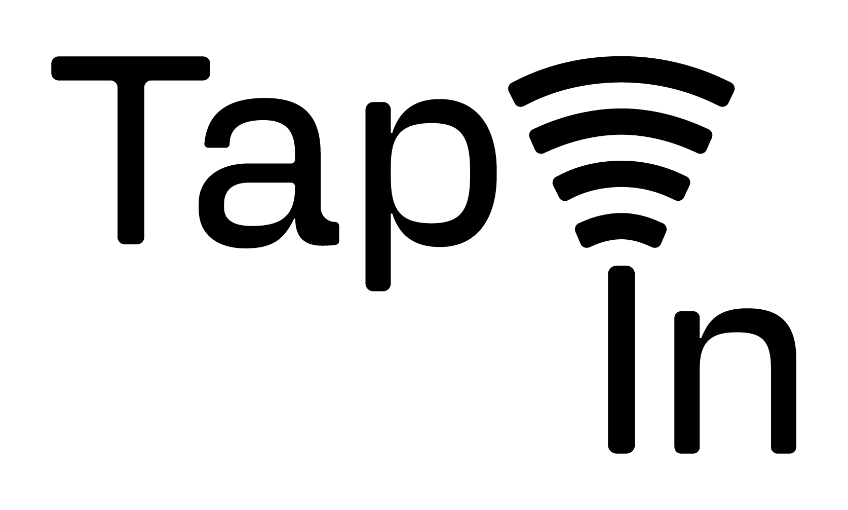
Logo Typography
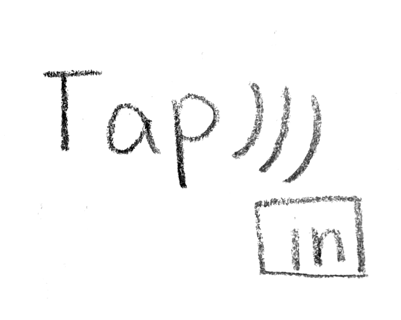
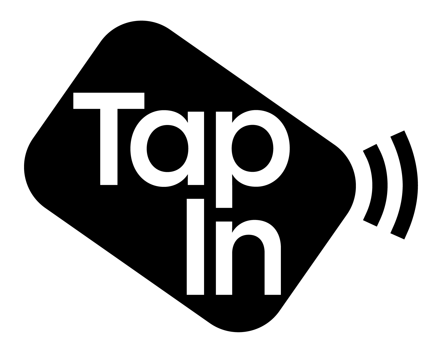
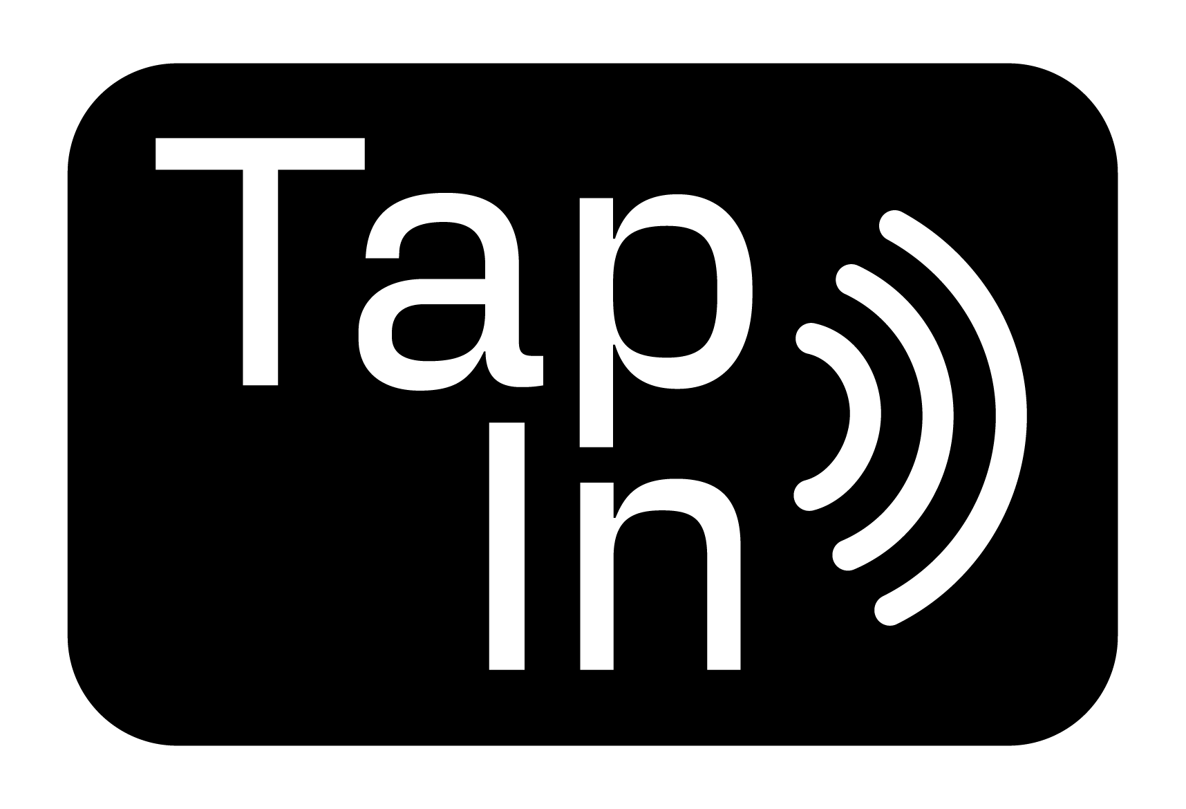
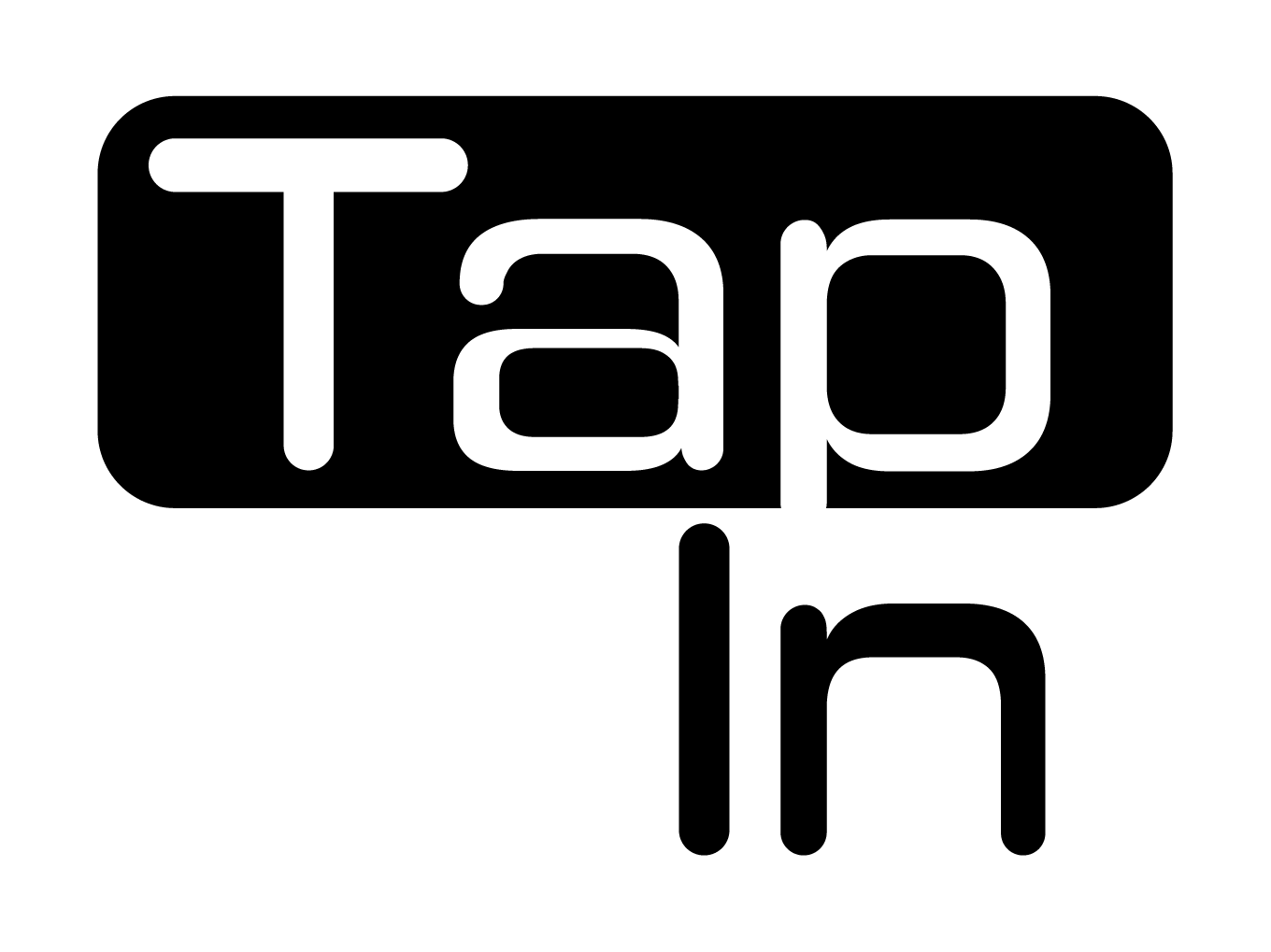
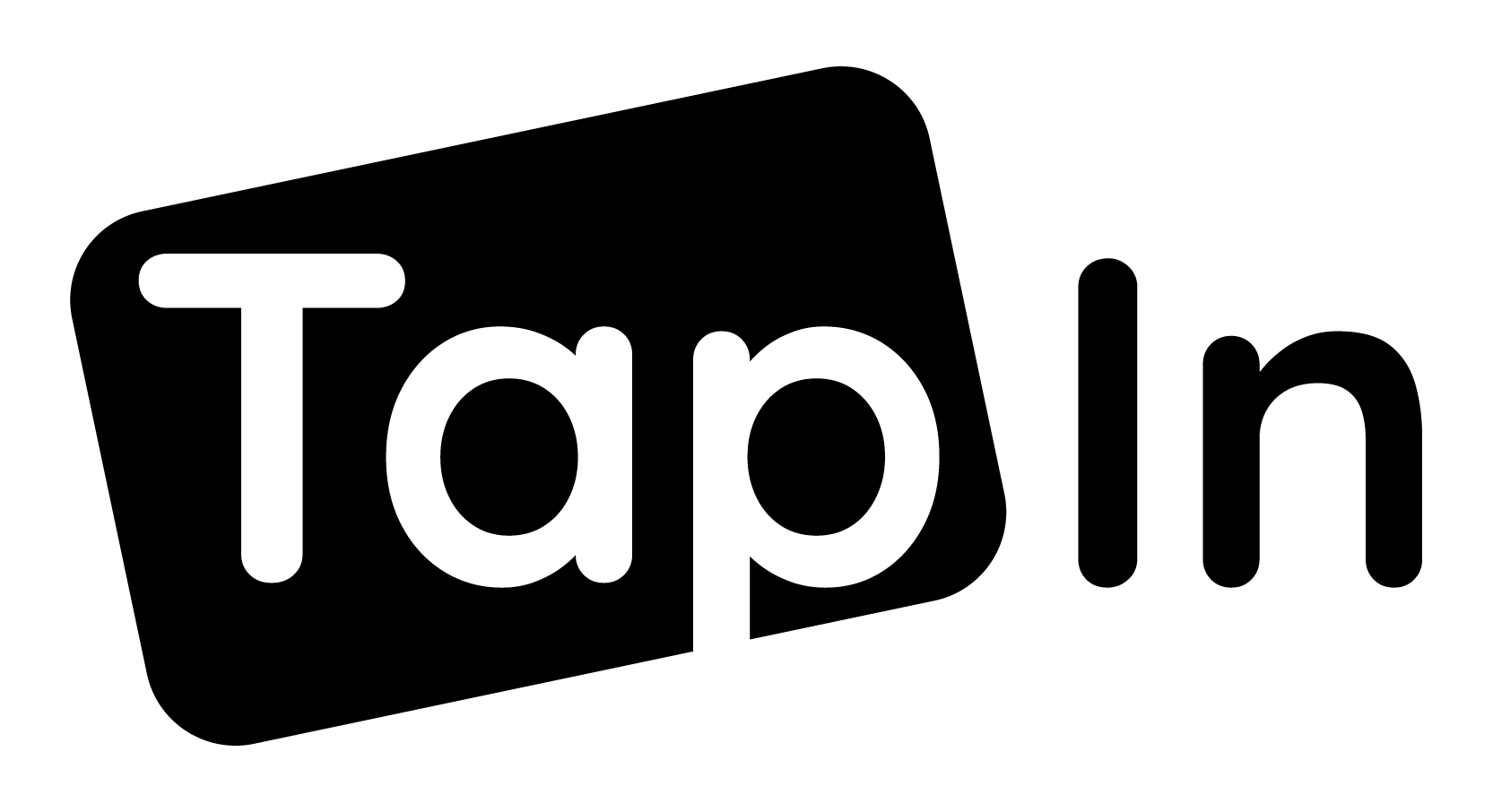
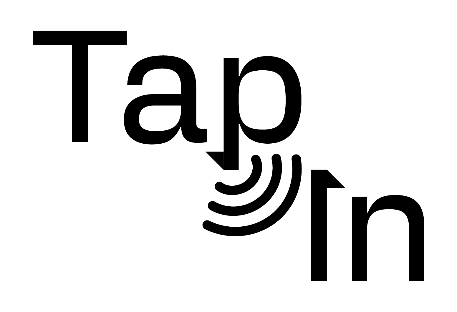
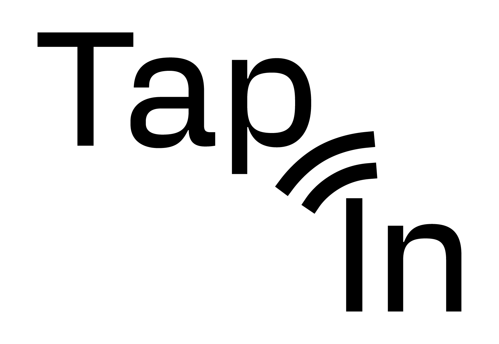
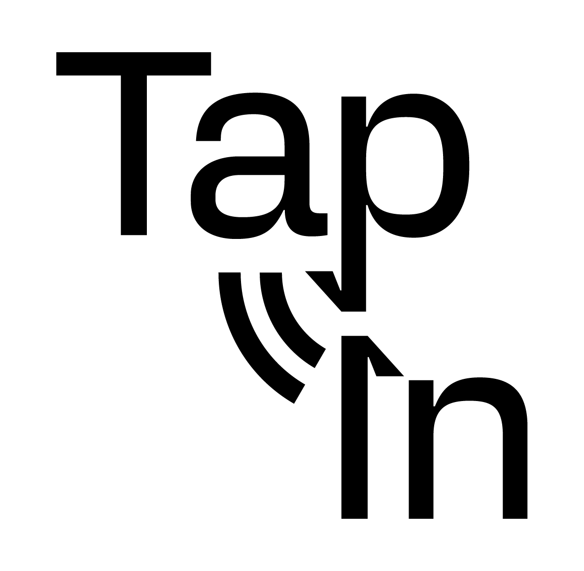
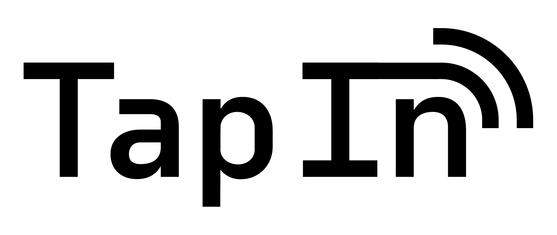
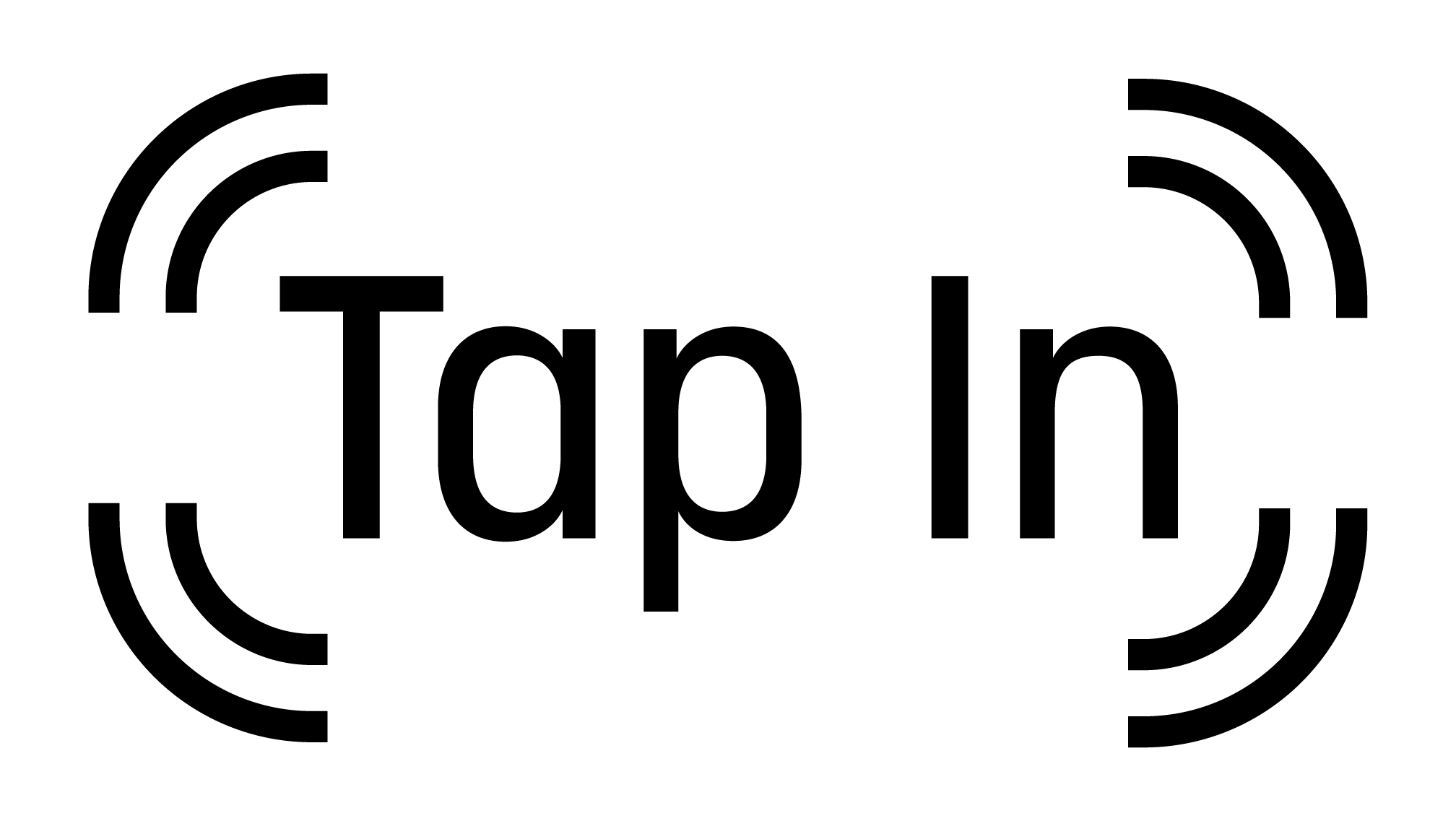
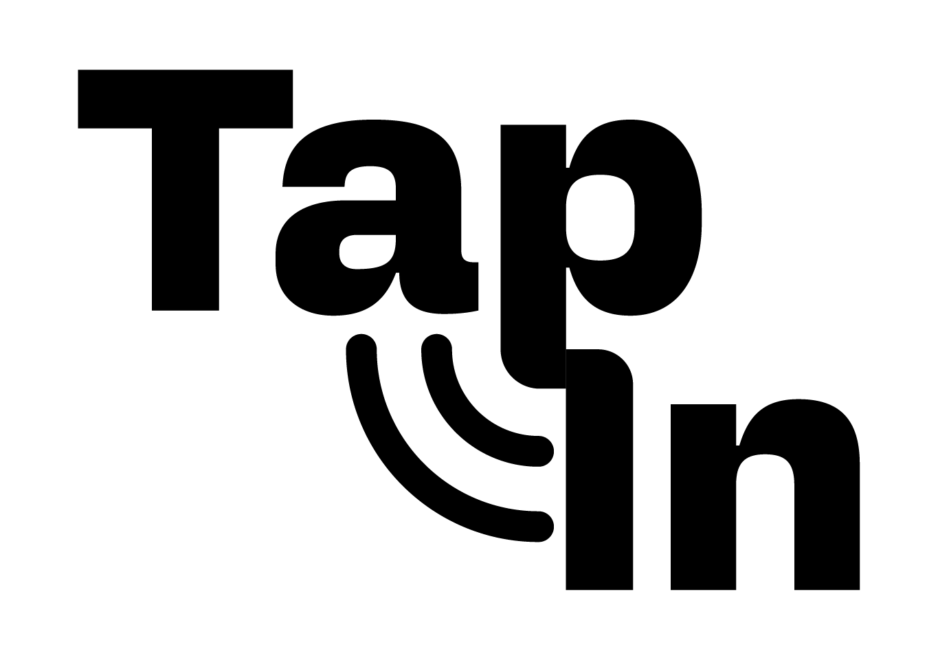
Final Logo Suite
The finalized logos feature an antenna with a similar width and proportion to the “P” in “tap.” The full and stacked logo incorporates a roundness to the top of the “I” and bottom of the “P”, visually representing the words “tapping into” each other.
Stacked Logo

Horizontal Logo
Full Logo

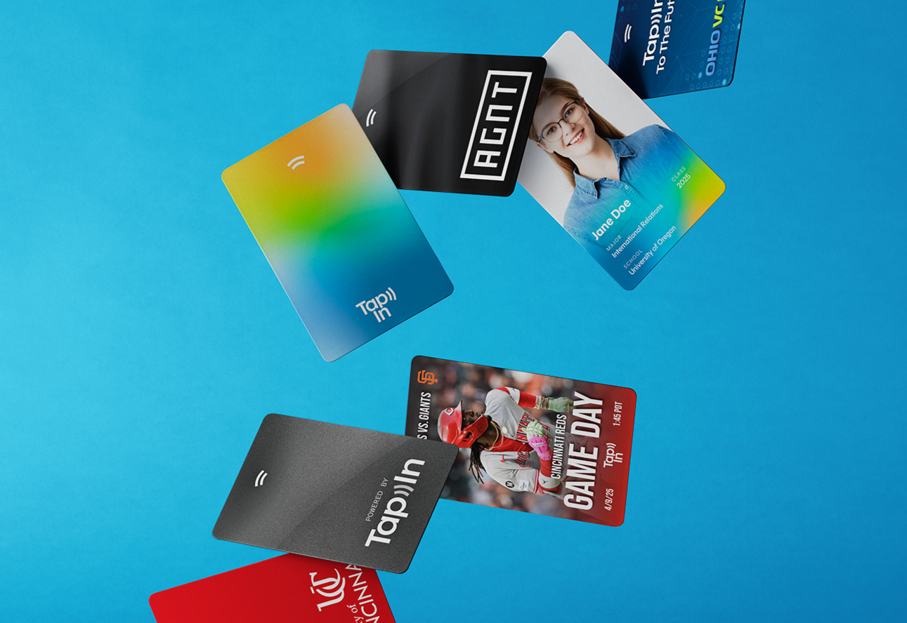
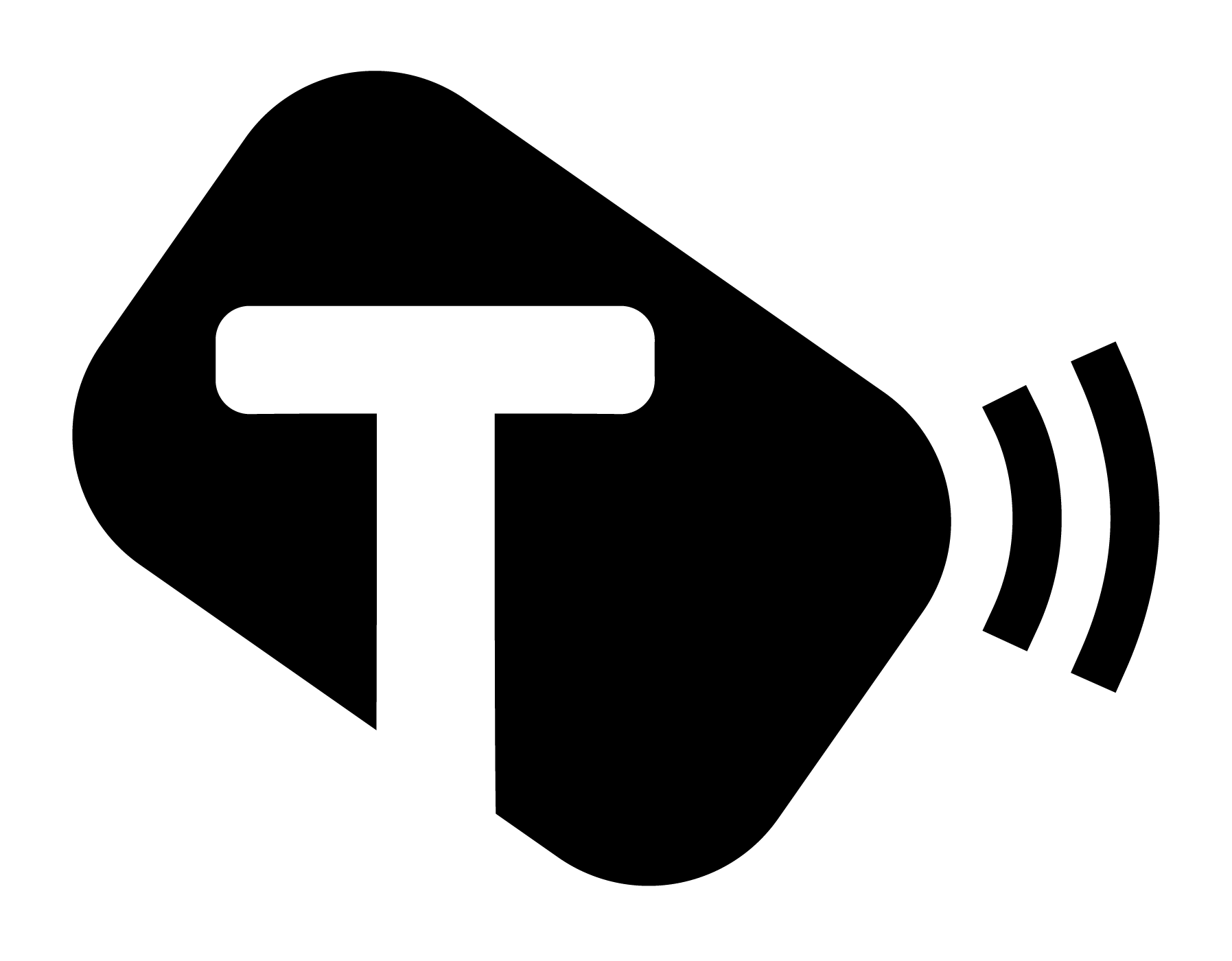
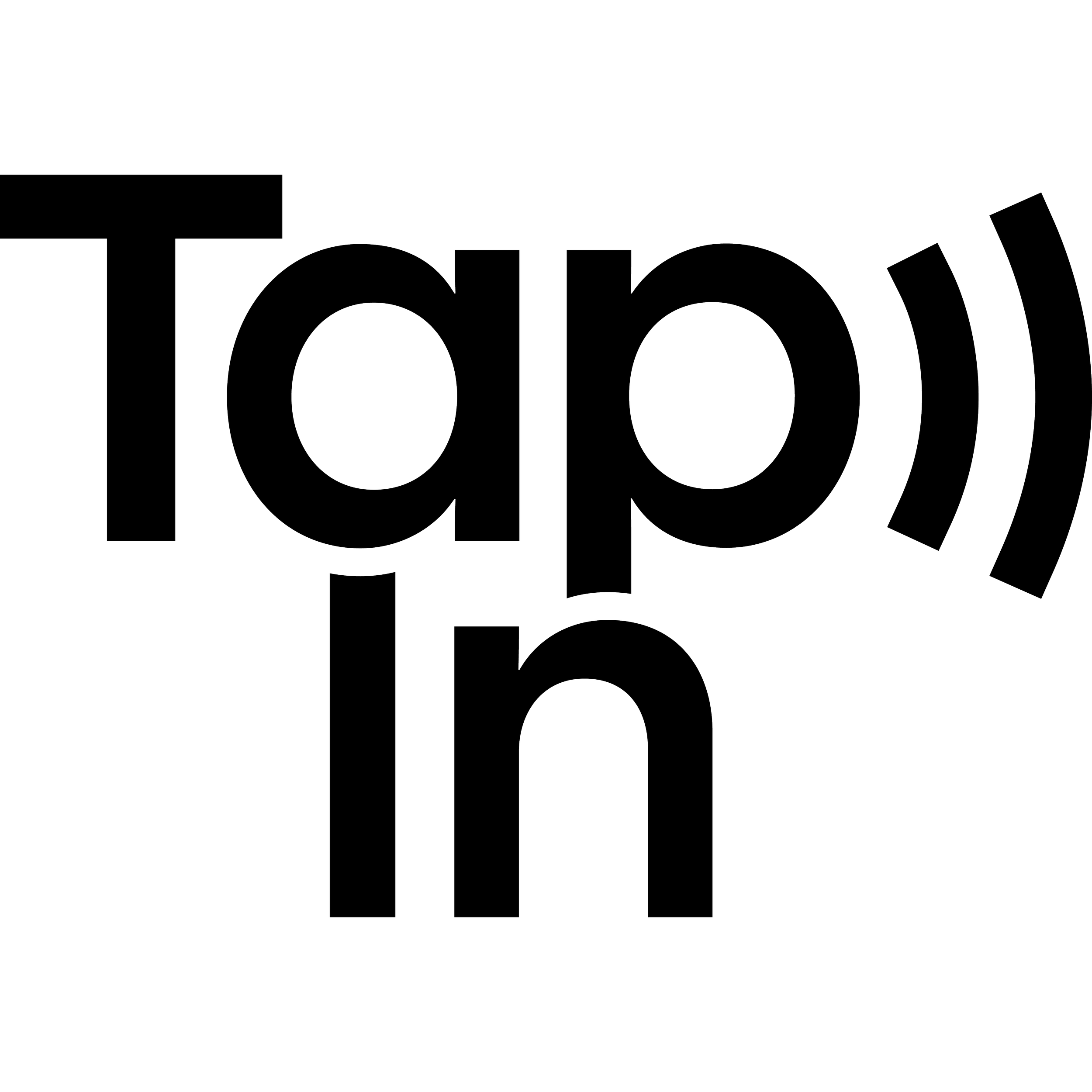
Color System & Icon

The palette communicates the brand's core
values of security (navy blue), protection (orange), and growth (green), all with a layer of friendliness
and fun (cyan). TapIn’s icon is an NFC antenna, used in the company’s devices.
HEX #83C215
CMYK 32-0-89-24
RGB 131-194-21
HEX #ffab3b
CMYK 0-33-77-0
RGB 255, 170, 59
HEX #08699E
CMYK 95-34-0-38
RGB 8-103-158
HEX #1bace0
CMYK 88-23-0-12
RGB 27-172-224


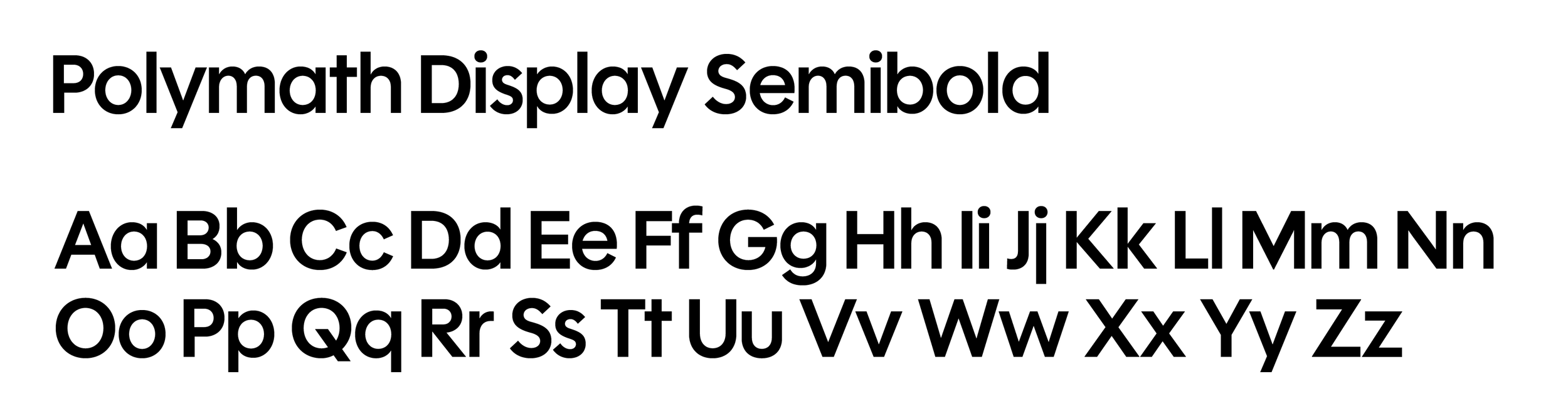
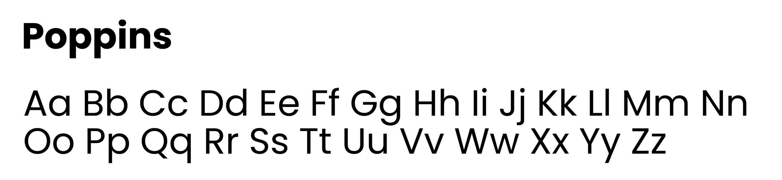
TapIn’s Primary & Secondary Typeface
These fonts are used when designing different graphics as complementary typefaces to the logo typography.
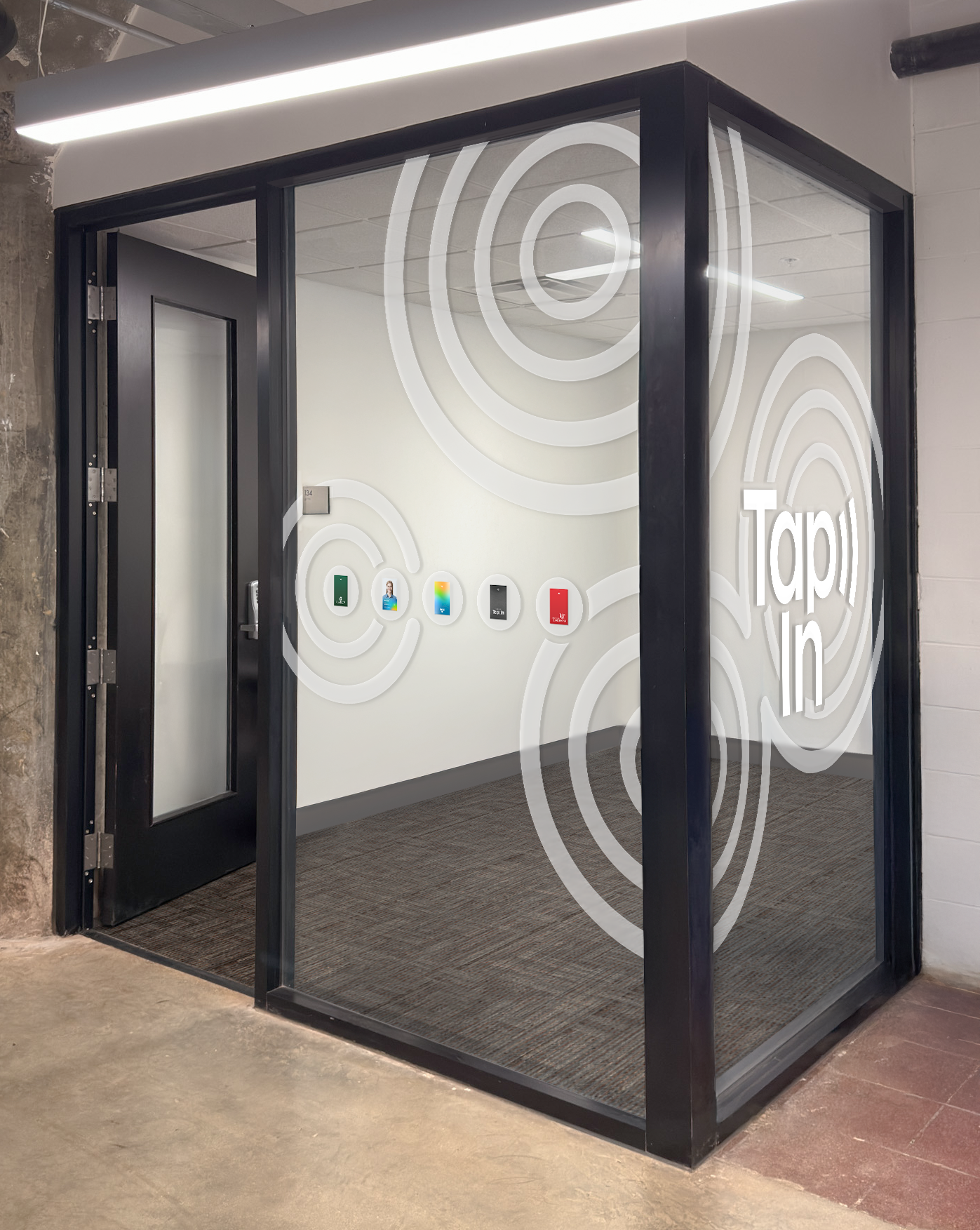
Other Projetcs at TapIn